03. Flexbox Guide
Flexbox
Getting Started with Flexbox
If you aren't familiar with flexbox you're in good company, because I'm not either. That's a joke.
Whenever I learn a new technology, I like to answer the question, “Why does this specific technology exist?” With flexbox, the answer to this question may just be that creating an all-purpose layout with CSS can be quite cumbersome. The whole goal of flexbox is to create a more efficient way to "lay out, align, and distribute space among items in a container, even when their size is unknown and/or dynamic". In a nutshell, flexbox is all about creating dynamic layouts.
The main idea of flexbox is that you give the parent element the ability to control the layout of all of their (immediate!) child elements rather than having each child element control its own layout. When you do this, the parent becomes a flex container while the child elements become flex items. An example of this is instead of having to float to the left all children of an element and add margin to each one, instead, you can just have the parent element specify to have all of its children be laid out in a row with even space between them. So, layout responsibilities move from the children to the parent. This allows for more fine tuned control over the layout of your app.
There's a lot of content in this section broken down into the following sections:
Flexbox Axes
By far, the most important concept to understand when it comes to flexbox is that flexbox is all about different axes. You'll have a Main Axis and a Cross Axis.
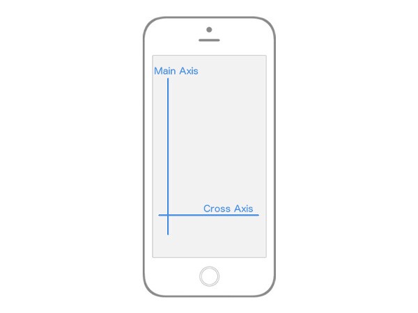
Flexbox Axes: Main Axis and Cross Axis
In React Native, by default, the Main Axis is vertical while the Cross Axis is horizontal. Everything from here on out is built upon this concept of a Main Axis and Cross Axis.
When I say "…which will align all the child elements along the Main Axis" that means that, by default, all the children of the parent element will be laid out vertically from top to bottom. If I say "…which will align the child elements along the Cross Axis" that means that, by default, all the children elements will be laid out horizontally from left to right.
The rest of flexbox is just deciding how you want to align, position, stretch, spread, shrink, center, wrap child elements along the Main and Cross axis.
Flex Direction
You'll notice that I was very deliberate in mentioning the "default behavior" when it comes to the Main Axis and Cross Axis. That's because you can actually change which Axis is Main and which is Cross. That brings us to our first flexbox property, flex-direction (or flexDirection in React Native).
flex-direction has two values:
rowcolumn
By default, every element in React Native has the flexDirection: column declaration. When an element has a flex-direction of column, its Main Axis is vertical and its Cross Axis is horizontal, just as we saw in the image above. However, if you give an element a flexDirection: row declaration, the axes switch. The Main axis becomes horizontal, while the Cross axis becomes vertical. Again, this is crucial because your entire layout is dependent on these two axes.
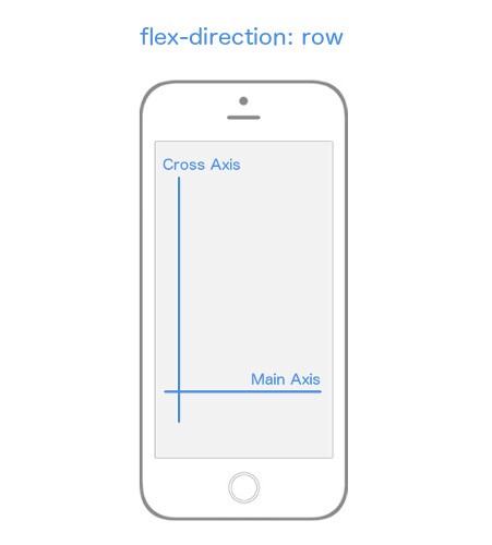
flex-direction changes which axis is the Main Axis.
Justify Content
Now is when things start getting fun. Let's dive into the different properties and values we can use to align child elements along these axes.
Let's focus entirely on the Main Axis, first.
In order to specify how children align themselves along the Main Axis, you'll use the justifyContent property. justifyContent has five different values you can use in order to change how the children align themselves along the Main Axis.
flex-startcenterflex-endspace-aroundspace-between
Woah. I just dropped lots of unfamiliar terms. I'll walk through each and every one of them though, so we're good 💃🏽.
If you want to follow along (which I highly recommend you do), create a new React Native project called "FlexboxExamples" and swap out your App.js code with the following:
import React, { Component } from 'react'
import { StyleSheet, Text, View, AppRegistry } from 'react-native'

class FlexboxExamples extends Component {
  render() {
    return (
      <View style={styles.container}>
        <View style={styles.box}/>
        <View style={styles.box}/>
        <View style={styles.box}/>
      </View>
    )
  }
}

const styles = StyleSheet.create({
  container: {
    flex: 1,
  },
  box: {
    height: 50,
    width: 50,
    backgroundColor: '#e76e63',
    margin: 10,
  }
})

export default FlexboxExamples;
Note that with the code above, the only thing we'll be changing is the styling in the container object in the styles StyleSheet object. Ignore flex: 1 for now.
Justify Content: Flex-Start
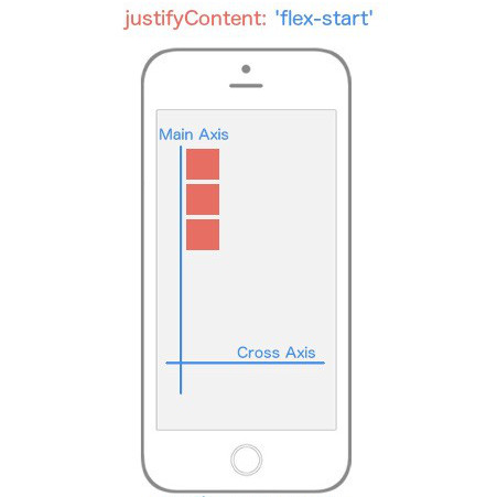
justifyContent: flex-start makes flex items appear at the beginning of the Main Axis.
justifyContent: 'flex-start' will align every child element towards the start of the the Main Axis.
container: {
  flex: 1,
  justifyContent: 'flex-start',
}
If you were still struggling with the importance of Main Axis and Cross Axis hopefully it just clicked. Because flexDirection defaults to column, and we're using justifyContent which targets the Main Axis, our child elements are going to align themselves towards the start of the Main Axis which is the top left and work their way down.
Justify Content: Center
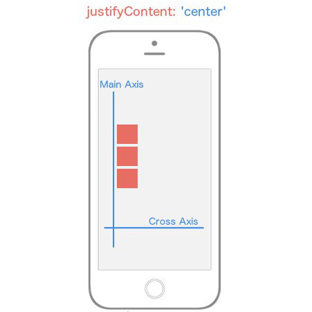
justifyContent: center makes flex items appear in the center of the Main Axis.
justifyContent: 'center' will align every child element towards the center of the the Main Axis.
container: {
  flex: 1,
  justifyContent: 'center',
}
Justify Content: Flex-End
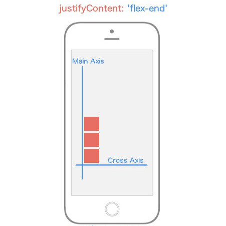
justifyContent: flex-end makes flex items appear at the end of the Main Axis.
justifyContent: 'flex-end' will align every child element towards the end of the the Main Axis.
container: {
  flex: 1,
  justifyContent: 'flex-end',
}
Justify Content: Space-Between
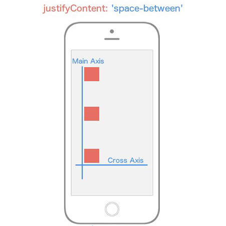
justifyContent: space-between flex items appear at both ends of the Main Axis with space between the items.
justifyContent: 'space-between' will align every child so that the space between each child is even along the Main Axis.
container: {
  flex: 1,
  justifyContent: 'space-between',
}
Justify Content: Space-Around
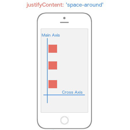
justifyContent: space-around flex items are spaced equidistant along the Main Axis.
justifyContent: 'space-around' will align every child element so that there is even space around each element along the Main Axis.
container: {
  flex: 1,
  justifyContent: 'space-around',
}
Now I want you to think about what would happen if we changed the flexDirection of our container to row instead of the default value column? Instead of our Main Axis being vertical, it's going to be horizontal. That means any child elements are going to align themselves horizontally rather than vertically.
container: {
  flex: 1,
  flexDirection: 'row',
  justifyContent: 'space-around',
}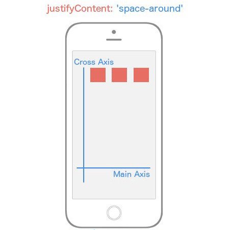
justifyContent: space-around with flex-direction: row changes the Main Axis to be horizontally with space around the flex items.
Notice that all we changed was the value for flexDirection, and it drastically altered our layout. Now you're starting to see the real power of flexbox.
Align Items (The Cross Axis)
Now let's turn our focus entirely to the Cross Axis. In order to specify how children align themselves along the Cross Axis, you'd use the align-items property.
You would think that alignItems has the exact same values as justifyContent. It's a reasonable guess, but you'd be wrong. This property has four different values you can use in order to change how the children align themselves among the Cross Axis.
flex-startcenterflex-endstretch
Align Items - Flex-Start
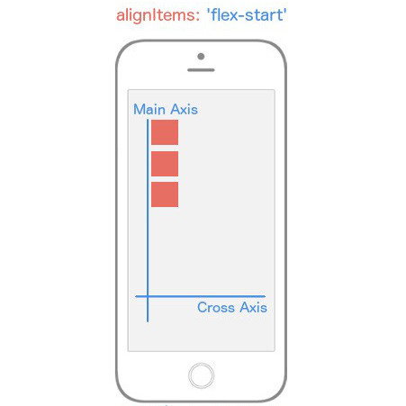
alignItems: flex-start causes flex items to appear at the beginning of the Cross Axis.
alignItems: 'flex-start' will align every child element towards the start of the the Cross Axis.
container: {
  flex: 1,
  alignItems: 'flex-start',
}
Align Items: Center
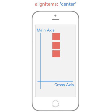
alignItems: center causes flex items to appear in the middle of the Cross Axis.
alignItems: 'center' will align every child element towards the center of the Cross Axis.
container: {
  flex: 1,
  alignItems: 'center',
}
Align Items: Flex-End
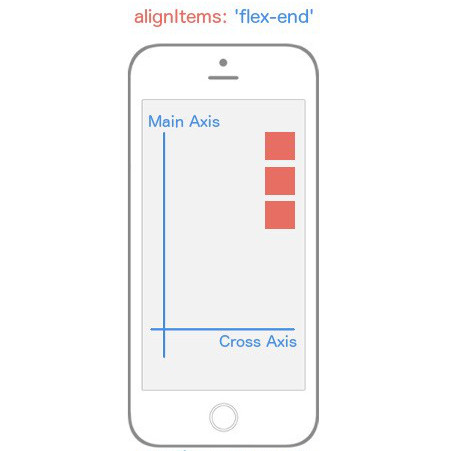
alignItems: flex-end causes flex items to appear at the end of the Cross Axis.
alignItems: 'flex-end' will align every child element towards the end of the the Cross Axis.
container: {
  flex: 1,
  alignItems: 'flex-end',
}
Align Items: Stretch
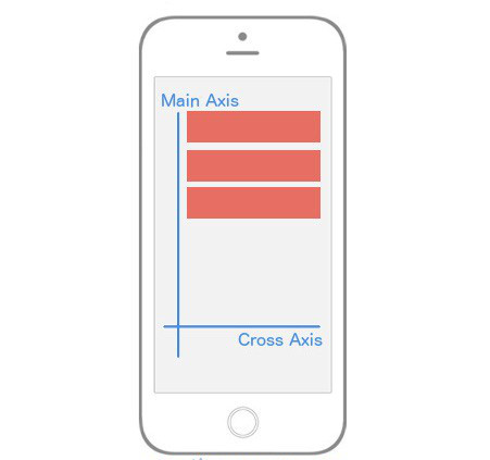
alignItems: stretch causes flex items to take up the full width of the Cross Axis.
alignItems: 'stretch' will stretch every child element along the Cross Axis as long as the child element does not have a specified height (flexDirection: row) or width (flexDirection: column).
container: {
  flex: 1,
  alignItems: 'stretch',
},
box: {
  height: 50,
  backgroundColor: '#e76e63',
  margin: 10,
}
Just when you thought you were getting the hang of it, flexbox throws a wrench in your brain. Whenever you set alignItems to stretch, each child element is going to stretch the full width or height of the parent container as long as that child element doesn't have a width or a height. Notice in the box styling, I removed the width: 50 because flexDirection is set to column by default meaning that flex items will be stretching horizontally (since we're using alignItems).
To cement this home, what will our UI look like if I change our styling to this?
const styles = StyleSheet.create({
  container: {
    flex: 1,
    alignItems: 'stretch',
    flexDirection: 'row',
  },
  box: {
    width: 50,
    backgroundColor: '#e76e63',
    margin: 10,
  }
})
Notice I've changed the flexDirection to row, and I've added back in width: 50 and removed the height: 50.
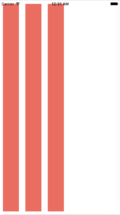
flex-direction: row and alignItems: stretch causes flex items to stretch vertically along the Cross Axis.
Let's break this down. First, the Main Axis is now running horizontally since we added flexDirection: row. This means that alignItems will be aligning the items along the vertical axis. Because we've removed the height of the child elements and added alignItems: stretch, those elements are going to stretch along the vertical axis for the entire length of their parent component, which in this case is the whole view.
Up until this point, we've only had one flex container or parent element. Don't get it twisted though; if you create more nested flex containers, the exact same logic above is going to be true for those child elements (flex items) but instead of being relative to the whole view (as in our example), they'll position themselves according to the their parent component. Your entire UI will be built upon nesting flex containers.
At this point, you're essentially a red belt in React Native styling TaeKwonDo. There are a few other flexbox features we need to look at, though.
You'll very quickly come to a realization that there are no percent-based styling in React Native. Though I agree it makes things a bit more difficult, everything you can do with percent-based styling you can do with flexbox. Remember the flex: 1 declaration we used in all the examples above? That's the property that's going to allow us to do it. Interestingly enough there's no exact comparison for this feature in flexbox on the web, but it is similar to flex-grow if you know what that does.
As we've seen over and over, flexbox is concerned with giving control to the parent element to handle the layout of its children elements. The flex property is a bit different as it allows child elements to specify their height or width in comparison to their sibling elements. The best way to explain flex is to look at some examples.
Centering Content
Let's start off with a view like this:
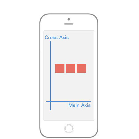
Centering content along both the Main Axis and the Cross Axis.
How would you implement that? Notice that our Main Axis is horizontal; this gives us a clue that we're using flexDirection: row. The boxes are in the center of both axes which means we're using justifyContent: 'center' and alignItems: 'center'.
const styles = StyleSheet.create({
  container: {
    flex: 1,
    flexDirection: 'row',
    justifyContent: 'center',
    alignItems: 'center',
  },
  box: {
    width: 50,
    height: 50,
    backgroundColor: '#e76e63',
    margin: 10,
  }
})
The Flex Property
But now, what if we wanted to change our UI to look like this:
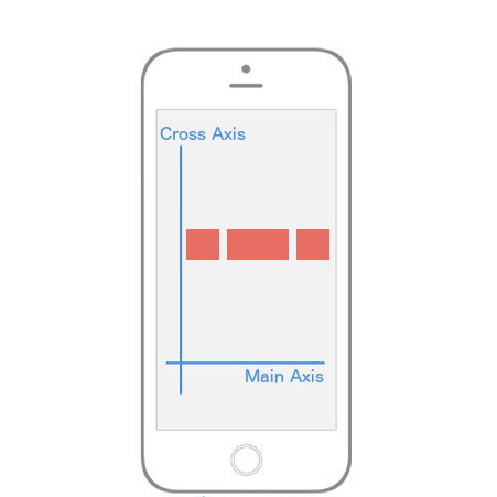
Using the flex property to change the rate at which a flex items increases its size comparable to other flex items.
In the above image, it's exactly the same layout -- but now the middle section is twice as wide as its siblings! This is what the flex property allows us to do. Here’s the code:
class FlexboxExamples extends Component {
  render() {
    return (
      <View style={styles.container}>
        <View style={[styles.box, {flex: 1}]}/>
        <View style={[styles.box, {flex: 2}]}/>
        <View style={[styles.box, {flex: 1}]}/>
      </View>
    )
  }
}

const styles = StyleSheet.create({
  container: {
    flex: 1,
    flexDirection: 'row',
    justifyContent: 'center',
    alignItems: 'center',
  },
  box: {
    width: 50,
    height: 50,
    backgroundColor: '#e76e63',
    margin: 10,
  }
})

export default FlexboxExamples;
Notice I didn't add any styles; I just made the middle sibling have flex: 2 while the other siblings have flex: 1. This basically says "make sure that the middle sibling is twice as large along the Main Axis as the first and third children". This is the reason why flex can replace percentages because usually a percent-based layout is just one where specific elements are relative to other elements, exactly like we're doing above. It's also important to note that if you place flex: 1 on an element, that element is going to take up as much space as its parent takes up. That's why in most of our examples above because we want our "layout area" to be the size of the parent, which in our examples was the whole viewport.
Let's go even deeper!
Aligning Individual Flex Items
What if we wanted a layout like this?
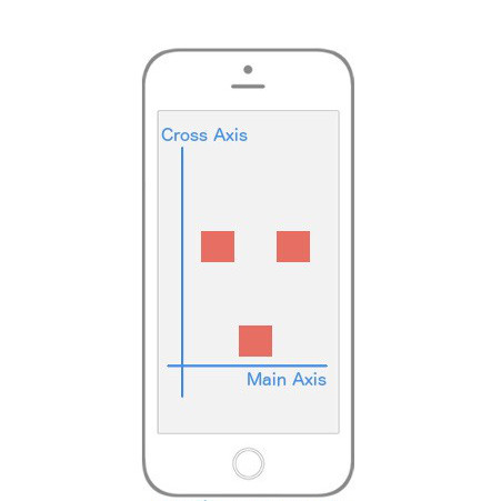
alignSelf: flex-end changes the flex item it targets to appear at the end of the Cross Axis.
It's as if the first and third element are centered both vertically and horizontally, but that second element has a mind of its own and is using flex-end along the Cross Axis. To implement this, we'll need a way to have the child element override a specific positioning it received from its parent. Good news: that's exactly what alignSelf allows us to do! Notice it begins with align, so just like alignItems, it's going to position itself along the Cross Axis. It also has the exact same options as alignItems (flex-start, flex-end, center, stretch).
The code to implement the image above is:
class FlexboxExamples extends Component {
  render() {
    return (
      <View style={styles.container}>
        <View style={styles.box}/>
        <View style={[styles.box, {alignSelf: 'flex-end'}]}/>
        <View style={styles.box}/>
      </View>
    )
  }
}

const styles = StyleSheet.create({
  container: {
    flex: 1,
    flexDirection: 'row',
    justifyContent: 'center',
    alignItems: 'center',
  },
  box: {
    width: 50,
    height: 50,
    backgroundColor: '#e76e63',
    margin: 10,
  }
})

export default FlexboxExamples;
Note that all we've done is add alignSelf: flex-end to the second child element and that overrode what it was instructed to do by the parent (alignItems: 'center').
If you've made it all the way through this, great work! I realize that was a lot to cover but I hope it's helped you get up and running with styling (and specifically flexbox) on React Native.
SOLUTION:
- Items are placed left-to-right
- Items are packed on the right side of the container
- Items are packed at the top of the container
Summary
React Native leverages a version of flexbox to build component layout. This is primarily due to flexbox's ability to provide consistent layouts across different screen sizes.
Flexbox containers comprise of two axes: a main axis, as well as a cross axis. Some of the more critical properties to consider when building layouts with flexbox include flex-direction, justify-content, and align-items. React Native's implementation of flexbox is a bit different, however. We'll see just how in the very next section!
Further Research